Pharma Advertising
Clients
Ultomiris®, Omnipod® and Foquest®
Role
Designer & Editor
Description
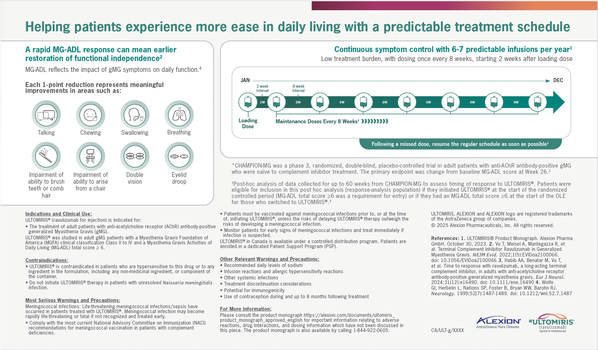
For Ultomiris®, Omnipod®, and Foquest®, the core challenge was translating dense clinical data, dosing protocols, and product mechanics into materials that feel structured, credible, and easy to navigate. Each piece was designed within strict regulatory frameworks, requiring precision, hierarchy, and consistency while still engaging healthcare professionals and patients visually. Across brands, I built modular layout systems that prioritized clarity first.
For the Foquest® titration guides and dosing charts, this meant creating clear comparative tables, colour-coded dosage progressions, and step-based visual cues that allowed physicians to quickly reference adjustments without cognitive overload. Data needed to be scannable in high-pressure clinical environments.
For Omnipod®, the focus shifted toward optimization and lifestyle integration. Bold typography, icon systems, and colour-blocked sections helped distinguish data insights from patient-facing education, ensuring both clinical credibility and approachability.
With Ultomiris®, the emphasis was on communicating efficacy data and treatment schedules with authority and reassurance. I structured complex graphs and long-term outcome data into clean, comparative visual narratives that balanced scientific rigor with empathetic storytelling. The layouts guide the reader through clinical endpoints, dosing cadence, and quality-of-life benefits without overwhelming them.
Throughout these projects, I collaborated closely with copywriters, medical reviewers, and client services to ensure alignment between messaging strategy and visual execution. The result is a body of work that merges structured thinking with human-centered design that transforms complex healthcare information into intuitive, visually engaging experiences that build trust and support informed decision-making.